Using color to wow your knowledge base users
By Catherine Heath on Writing docs from January 3, 2017
80% of information processed by online users comes from sight - through visual cues. This means that color is hugely important in orienting your users when they come to your knowledge base.
The Institute for Color Research confirms that effective use of color can improve comprehension as much as 73%.
You can improve readability up to 50% by contrasting chromatic colors (colors with a hue) with each other rather than using black, white or gray.
To learn more about colors, their meanings, and color combinations to wow your knowledge base users, check out online resources such as Canva's Design Wiki on Colors and Adobe Color CC.
Some companies get it right - and wrong.
Companies getting it right

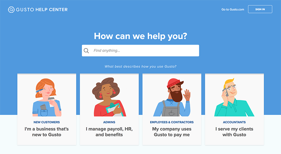
HR SaaS company Gusto’s knowledge base is a great example of compelling design. The interface is bright and well-spaced, with interesting illustrated icons for each top level category. The color palette is soft enough that it’s fun to view without being distractingly bright.

Website management platform Pantheon is a great example of a company investing in the design of its knowledge base. They’ve moved away from their punchy black and yellow branding to use a blue and white color scheme that is easy on the eye.
The retention of splashes of their original branding ensures that their knowledge base is still clearly part of their company.
Companies getting it wrong

Media company Sky’s knowledge base for their customers is a bit too image heavy to be truly easy to use. It almost comes across like a catalogue of products rather than a helpful tool.
The photographs of electronics representing their different categories are distracting, and make it hard for the user to orient themselves.
The HBO knowledge base uses white text on a black background and isn’t particularly pleasant to use. Although the color scheme is on brand with the rest of the website, it’s not an easy combination for digesting information.
It’s also barely more than a simple text list, meaning that users can only use their reading skills to navigate around the site.
Bad use of colour
According to SHIFT, colors should be bold, not bright, for effective learning.
Too many colors will almost certainly end up distracting your users and make it harder for them to process the information in your knowledge base.
As a good rule of thumb, try to stick with two base colors, plus one more color to highlight important elements.
Note about accessibility
It should be noted, web accessibility guidelines state that you shouldn’t rely solely on color for navigation as this reduces accessibility for visually impaired people.
You should also employ visual aids like universally understood icons, and include text to ensure that users of all abilities can use your knowledge base comfortably.
Conclusion
It’s fun to play around with color for your knowledge base, and of course it’s important to stay consistent with your brand.
Keep in mind the important role that color plays in learning and comprehension, and pair suitable colors together to help your users.
Don’t stick with your brand colors at all costs, because the color scheme that suits your marketing materials may not also be the best for more sombre materials such as documentation.
Make sure you research other knowledge bases by companies that are doing it right to maximize your chances of choosing a color scheme that works.
KnowledgeOwl provides knowledge base software with full customization capabilities, so you can style your knowledge base how you like. Sign up today for a free trial.

Writing docs
(253)

General posts useful to all documentarians about writing documentation, editing and publishing workflows, and more.


Feature spotlight
(15)

Your flight plan for how to get the most out of KnowledgeOwl features and integrate them into your workflows.


Announcements
(21)

Major KnowledgeOwl company announcements.


Customer stories
(9)

Learn how others are using KnowledgeOwl & get pro tips on how to make the most of KO!


Company culture
(40)

Find out more about who we are and what we value.


Support
(75)

We believe good support is the foundation of good business. Learn about support tools and methodology.


Tools
(64)

Learn more about tools to solve various documentarian issues, within and beyond KnowledgeOwl.


All
(384)

Not sure what category you need? Browse all the posts on our blog.

Got an idea for a post you'd like to read...or write?
We're always looking for guest bloggers.
Learn moreStart building your knowledge base today
- 30 days free (and easy to extend!)
- No credit card required
- Affordable, transparent pricing
- No cost for readers, only authors
Want to see it in action?
Watch a 5-minute video and schedule time to speak with one of our owls.


